The Guardian Labs
Who Gives A Crap - The art and evolution of eco-design
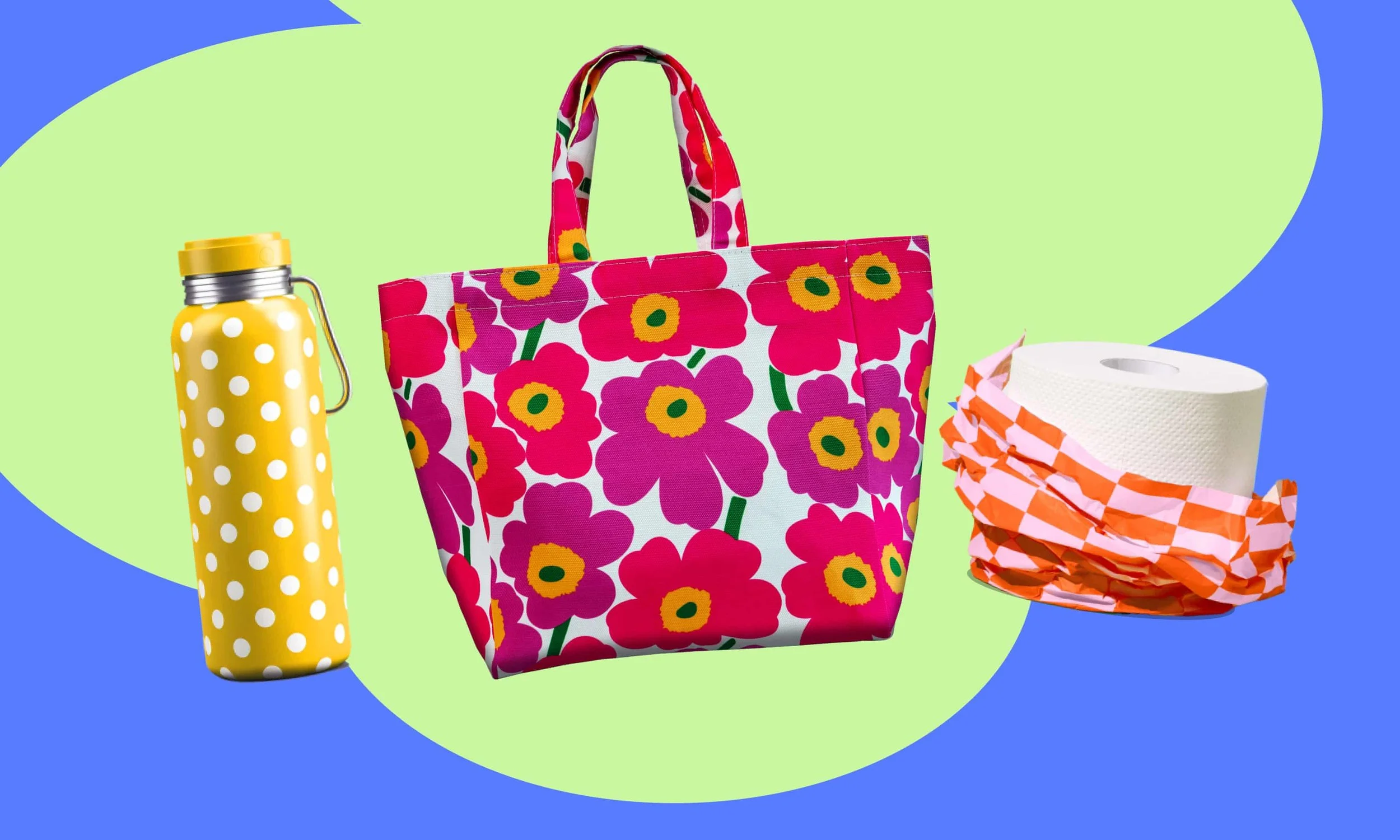
When it comes to eco design, bland is out, with more environmentally inclined brands favouring the bold
If you grew up in the 80s or 90s you may remember the first rumbles of “going green”. Back then, being eco-minded meant filling your home with green and beige crafty-looking products clad with the odd nature-focused logo. Think kraft paper, green pine tree silhouettes, tactile-looking hessian and plain brown cardboard. This literal take on eco-design was a far cry from the more innovative approaches edging their way into the space today.
Eco-brands are increasingly challenging the status quo, bringing in fashion-forward, chic designs with vibrant shades and, at times, a cheeky edge.
Research tells us colour plays a vital role in consumer-brand relationships. But the inclination for eco-brands to gravitate towards those classic signifiers – in part fostered by studies around colour psychology that implied green depicted environmental friendliness – has gradually shifted.
Alongside the emergence of bold tote bags brandishing slogans such as “Your plastic bag can kiss my canvas”, and reusable water bottles clad with pastel hues, are more understated products, such as those you use to wipe your rear, wrapped in far-from-understated designs.
Who Gives A Crap has been at the helm of the “out with the green and beige, in with the vibrant and fun” since it burst onto the scene in 2012. Robed in bodacious recyclable paper, its designs flaunt bright colours, bold geometric patterns, and the odd bum reference.
The goal? To put a smile on your face and make your daily ritual a joyful one. Loo rolls aren’t exactly the sexiest product in the world, yet Who Gives A Crap’s designs elicit an unexpected sense of joy for anyone visiting the porcelain throne.
The brand’s design lead, Belen Ramos, says Who Gives A Crap has always challenged the traditional conventions of eco-design.
“We’ve really taken a different approach,” she says, explaining that Who Gives A Crap’s design has been less about making a connection with nature and more about the feeling you get when you choose to be a conscious consumer.
While doing good for the planet is entrenched in every aspect of Who Gives A Crap, you wouldn’t know it at first glance.
“We talk about sustainability a lot but it doesn’t come through in our visuals,” Ramos says. “We want people to feel good about doing good.”
These days, the public is more informed about the importance of choosing products geared towards a more sustainable future; the consumer mindset has shifted. The health of the planet is a growing concern for Australians and climate change is a driving factor for many consumers. A 2022 report on Australian consumer attitudes to climate action revealed one in two Australians actively look for more environmentally friendly products.
With consumers more interested in their impact on the environment and more brands joining the ranks, simply being “eco” is no longer a point of difference. Ramos says this has seen the emergence of a new era in eco-design.
At the outset, communicating a brand’s ethos and affinity to nature was the crux of visual design.“The result was a lot of earthy tones, greens, and that crafty look,” she says. Obvious markers of sustainability.
Now, brands don’t need to overtly imply their Earth-friendliness. “We don’t need to be talking about eco as much now that it’s expected, and [brands] can really lean into who you are as a brand and what makes you unique.”
More are joining Who Gives A Crap in the rage against beige, with maximalist colour becoming more common in sustainable branding.
“Last year we were still seeing a lot of beige and, you know, people still really felt beige cues ‘eco’, that we need to do it this particular way, and I think that’s out the window entirely now,” Ramos says.
“We’re seeing brands experimenting with colour, typography, illustration, a really fun tone of voice, and generally being more playful.”
Enmeshed in the visuals, good design elicits emotion. “Delightful is a big word for us,” Ramos says. It’s an atypical association when it comes to visiting the loo, perhaps, yet this multifaceted approach to design works. And the proof is in the hundreds of Instagrammed loo rolls gracing our feeds, their owners proudly flaunting their affinity to eco.
“If we can make them smile along the way, because there was some unexpected fun moment, then that’s a win.”
This article originally appeared on The Guardian Labs.